Tuesday, 26 November 2013

Pop Magazine Research: Page Analysis

Front Cover Analysis


 I'm looking at two different covers of pop magazines because this is the genre that I am most appealed by to focus my magazine on. The two that caught my eye the most were from TOP of the POPS and WE LOVE POP, these two particularly intrigued me because I feel as if they have similar target audiences therefore they are similar in what they feature throughout their magazine and the colours that run through the magazine. These two covers show that pink is definitely a dominant colour for their target audience, which is a very stereotypical outlook on the younger female audience as they are regularly associated with liking the colour pink, this is therefore something I will probably do on my magazine too as it fits my target audience too. The font type across these photographs is most commonly sans serif font as the audience is a younger audience therefore aren't usually associated with the classier and more sophisticated look that serif font gives. The main model is also an important feature of the magazine as they are one of the things that are most appealing to the audience as they often feature their favourite artists so I want my magazine to reflect the same concept. The coverlines throughout the magazine often relate to the same kind of thing, commonly revolving around popular music artists with interviews, gossip and information from them as well as things such as fashion and make up being included because of the fact the magazine is aimed at young females and that also fits with their target audience as well as their music taste.

Contents Page Analysis


These are two different contents pages from 'WE LOVE POP' and 'TOP of the POPS' both are very colourful and bold, however the colours involved are very different to eachother, in 'WE LOVE POP' the common colours are shades of blue and orange which is very different to the usual use of pink, however in this case it still relates to the magazine because of the fact it is relating to guy crushes that girls have as the page is primarily revolving around the teen crushes with many boys appearing so in this case even though it's blue and orange it is still relative to the target audience and works to the content. 'TOP of the POPS' however is is primarily revolving around the colour pink which is a far more predictable and relevant colour as it is the colour associated with the target audiences age group. I think contents pages can afford to have a wider variation of colour which is proved by these two covers as it makes it look busier and more fun which is good for the age group. I think also both contents pages are really heavily revolved around photographs as this is much more of a attracting way to entice the audiences and bring them to certain pages. I think another convention is definitely to have a lot of page numbers and articles summed up as this gives a sneak peak therefore these are definitely elements which I want to include when I do my contents page.

Double Page Spread Analysis


These are double page spreads from 'We LOVE Pop' and 'TOP of the POPS'. I think both show a very popular way of presenting interviews with popular celebrities, with one extremely large photograph of them on one page, and a really large title with a pun or pull out quote, something really catchy or enticing so that it draw people in so they want to read the article. I think from these two double page spreads, colour is quite key in these too as they have to match and compliment each other. I think another thing which I've picked up from the text is the use of colour and the way the font changes as well as the colour which separates it and makes it easier to read, this is something which I think would be key when I do my double page spread as making it easier to read is really important as my target audience aren't the most sophisticated therefore it is far more well suited, this goes for the magazines too as they have to suite their target audience.


Double Page Spread Conventions


  • Usually include interviews or an article.
  • Colour scheme runs throughout both pages and is relative to the content.
  • Large photograph of model as well as a smaller image.
  • Big headings with many colours relating to colour theme.
  • Pulled out quotes appear frequently.


Monday, 25 November 2013

Proposal for Music Magazine


Who you are aiming your magazine at specifically?

For the target audience of my magazine I want to aim the magazine towards teenage girls, this age may range from 10-16 but more specifically I will be aiming it towards around 13-14 year old girls. I have chosen this age bracket for my target audience because after conducting a bit of research on other pop magazines I think it's clear that this is the most popular age bracket and it is the age of most who are going to want to buy these magazines as well as are interested in the artists, genre and content of my magazine. I think the typical reader for my magazine will come from a working to middle class background as their family must be able to afford the price of the magazine as an extra.

What will your magazine be about? 

The typical content for my magazine will be based on a lot of artists which are popular and upcoming as I am aware of the fact that teenage girls around this age idolise celebrities a lot therefore they will play a big role in the magazine, specifically those involved in the pop music industry as this is obviously the genre that my magazine will be about therefore it will have to relate to that. Alongside this I think other interests appealing to the audience will entice them like style however it will all have to be relative to the artists to keep within the music magazine style, in addition, general music magazine content like upcoming songs, artist gossip, artist information like interviews and discounts for music related events and merchandise.

What are your ideas for cover lines?

The coverlines will be relative to the content of my magazines however I will want to make them very enticing like with artist gossip and information which I think would be appealing to the target audience as it's something about their artists they idolise that they didn't know, as well as an interview which would also be really appealing in my opinion. Alongside this I think discounts, promotions and things that are free to them would be good to include as obviously at this age they don't have a lot of money therefore if they are getting multiple things for a affordable price it's going to appeal to them further.

What title have you decided on and why? 

For the name of the magazine I found it really difficult to find a magazine name that I liked because I didn't want something too tacky but I also wanted something which was going to clearly identify the genre of music the magazine is about as I didn't want anything to complicated so that my target audience wouldn't immediately recognise it. I also wanted a fairly short title so this is why I disregarded names such as latest tunes and you love pop as I thought they wouldn't fit well as a masthead, instead I thought about synonyms for music so that the name was short and snappy however I didn't feel they fit the pop genre well enough therefore most of them I disregarded too and carried on thinking more specifically about names featuring the word pop. I think after trying out different fonts and designs for different names which were LovePop, SimplyPop and JustPop I concluded that my favourite was SimplyPop, even though I did like LovePop I thought it was too similar to existing magazines which is why I disregarded that as a title.

What fonts do you want to use?

I want a sans serif font for the younger audiences as it doesn't reflect a more sophisticated and classy look which perhaps serif font would give through the use of fancy feet therefore it would be far more appropriate for them as it is far simpler as well as the shapes being more rounded giving off a more funky and younger vibe. 

What are your ideas for taglines? 

I am unsure if I want to use a tagline at this stage but a few that I am considering using are
  • UK's favourite pop magazine
  • Your guide to your favourite artists
  • Simply gossip, your favourite artists and the latest fashion
Or anything else that ties in with the masthead and contents as well as being short and catchy.

When in the year will it be published? (cover can reflect seasonal changes or events, consider the academic year)

I want to do a summer edition so perhaps the last two weeks of July when school is out or August, for this idea I want to get a colourful image that reflects the summer months on my front page and I would also like to revolve the contents around this time of year therefore including things about summer.

What kind of image do you expect to put on the front cover and how will you go about getting this image?

Due the fact I am aiming it at the Summer month, I will choose a good day in terms of weather so that it looks summery as well as picking a natural and colourful location. I also want a lot of colours in terms of the outfit my model will be wearing therefore I will probably dress them in a summery and colourful outfit that reflects the month well.

How frequently would it be published?

I was thinking of doing a weekly issue as it's not going to be a massive issue and it would be best to update it frequently rather than doing more expensive bigger issues, as well as the fact when I did my questionnaire weekly was a popular option so it seemed appropriate to do a weekly issue as it is what I want to do anyway.

What are the dimensions of the cover (magazines are now available in different size formats)?

I will do the cover in an A4 size which will run through the entire magazine.

What images/colour would you use on the contents page?

I would like to tie in the contents page with the front cover a little bit therefore I will include most colours which are associated with my target audience, such as pink and purple, however I do want a contrasting colour to make colour a dominant part that 'pops' so that the page seems more busy and fun.

Music Magazine Research: Sales Reports and Background Research

Sales Reports 

Top of the Pops : 78,352 - % change y/y: -20.1 - Sold copies: 78,352
Kerrang! : 40,203 - % change y/y: -6.6 - Sold copies: 39,950
We Love Pop Magazine : 50,505 - % change y/y: - Sold copies: 50,505
Q : 64,596 - % change y/y: -19.7 - Sold copies: 63,812
New Musical Express : 23,924 - % change y/y: -17.6 - Sold copies: 23,898


I researched some figures about the sales of some popular magazines. From this I wanted to achieve where there would be a gap in the market or what magazine style would be successful in the industry to give me ideas of what to do and what not to do. 

From the research that I have conducted I can clearly see that NME magazine isn't doing well on the market. From my ABC source it is clear that their sales have decreased majorly which is then supported by the above research (sales reports) which show a minus percentage change as well as a considerably low amount of sold copies in comparison to the other magazines mentioned as NME has got the least amount of sales. From further research that I have conducted, an article from the guardian also states that NME and Q have both suffered sales declines by almost 20%, this suggests that it is similar for the genre and style of magazine they are, and that this genre is declining, from the sales reports figures above I can see from the sales the magazines such as Kerrang!, Q and NME sell considerably less copies than pop magazines which are shown. Also from the ABC sourced image there is a lot of negative change within the similar kind of genre aimed magazine. 
On the other hand pop magazines like We Love Pop and Top of the Pops have sold quite a lot of copies, especially top of the pops which has sold the most copies, this suggests to me that this is a popular market therefore one I should probably consider when deciding the genre of the magazine that I am going to make. In comparison to what I have just stated though, magazines of an alternative/rock genre are really popular as there are a lot on the market (ABC Source) and the change in sales only happens in some magazines therefore with a spin on the magazines there is most likely a market for this kind of magazine as long as it's done well.

"The Source also converted and consolidated a previous Chapter 7 filing in Friday's court proceedings and listed assets of about $1.3 million and liabilities of $35 million according to sources. 

Founders Dave Mays and Ray Benzino were ousted from the company in 2006, when sluggish newsstand sales and lost ad revenue prompted a need for a change.

One of the company's biggest financial issues prompting change in management was The Source defaulting on an $18 million loan from Textron Financial Partners.

According to the bankruptcy filing, The Source stopped sending magazines to 140,000 subscribers and magazine subscriptions have dropped by more than 50% since 2002."


There isn't that many sales reports on rap and hip hop magazines however I did manage to find out a bit about The source which is a hip hop music magazine is one that is declining in sales too, the article above suggests that it has struggled with profits which is most likely because it isn't selling well enough, it also suggests that the popularity has decreased from the subscriptions which implies that this magazine is doing really badly in terms of sales, I can't really link this completely to the genre of music however because I have nothing else to compare it to of the same genre, although I will have to consider it is probably either because of the genre it is linking to or the magazine isn't appealing to the audience anymore.

In terms of the actual music, unrelated to magazines, pop would definitely be considered the most popular because of the fact it in fact means popular therefore a wider audience listen to this genre of music as it is always in the charts across the world therefore to base a magazine on it would be ideal to appeal to a wider audience. However alternative and rock music is becoming increasingly popular and getting into the charts therefore will also have to be something to consider. Chart music often consists of  pop, alternative and rnb therefore these will be the three music types I want to look at in more detail because they are clearly the ones who appeal to a wider audience. 

This is an example of what I am talking about as the charts now consist of indie/rock, rap/rnb and pop.

Music Magazine Research: Analysing Photographs

These two images from The Source and Vanity Fair differ in composition, Vanity Fair has taken on the rule of third as Lady Gaga is placed on the right third drawing the eye to her posture, the intersection points on her posture lead the eye towards her hand whilst the other is covered by text, on the other hand in The Source, the subject has been centred in the photograph therefore the intersection points don't create focal points at all as he has been placed in the middle third, however the top third of this image does draw the eye to his. 
The lighting in both images draws both to the face of both models, on the cover of The Source the light is coming from above creating shadows down his neck, this draws you into his face as it's highlights contrasts with the shadows created on the neck. On Vanity Fair the idea of contrast also applies however in a different way, the clothing that Lady Gaga is wearing contrasts with her face and hair as her fair hair and skin is so different from her black clothing therefore the eye is drawn towards her face, her face is also well lit by light therefore adds further attraction.
There is a use of lines in both photographs in different ways. On the Vanity Fair cover the lines are more dominantly her arms and legs which stem from around her face which draws further attention to her face, however the use of lines on the cover of The Source is from the gun which has been held, this draws attention to this part of the photograph which also adds further drama and attention because of what he is actually holding.
The angles of these images looks more like the camera was held from below, in the Source the position of the model is emphasising this as his head is held quite high therefore making it seem like the camera is lower than it probably was, the use of this angle makes the subject look bigger and emphasises his face, similarly on the cover of Vanity Fair the position of the model is similar in terms of the head as it is also raised slightly which has a similar effect in emphasising her face.
On The Source cover the face tattoo that is on the subject lefts side is also emphasised as it has a shade of red running through it which has been pulled out and emphasised by the red text on the magazine, similarly the shade of grey in the masthead of Vanity Fair also emphasises the contrasting silvery grey that runs through the black outfit the model is wearing.
To conclude, the different colours, angles, lighting, composition and contrasts throughout photographs play an important role in where they eye is drawn therefore are things I will need to consider when I am taking photographs for my own magazine.

Monday, 18 November 2013

Music Magazine Research: Questionnaire

I created a questionnaire which I had asked to students throughout my college aged 16-19. This is the magazine that I created, I separated the genders so I could distinguish the difference in genders to help with my target audience and I asked questions which I wanted to know out of my audience, the teenage audience is the one I was aiming towards so the audience for this questionnaire is perfect for what I wanted. The questions I asked were very representative of what I needed to know and gave me a lot of information about what the audience I was considering would look for in a magazine.
These were the results of the questionnaire, I asked 25 males and 25 females to get a broad and in depth analysis of the audience.

Results

Males 

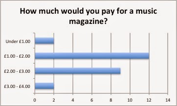
This question told me that males would pay around £2.00 as an estimated average for a magazine therefore if I chose to use males for my target audience I will be aware of the price range that the magazine will be. Above £3.00 is probably going to be far too much for my audience to want to buy the magazine for.


The most appealing genres of music for males are pop, rock, alternative and rap which is something I will have to consider if I chose to base my magazine on one of these genres.


When thinking of how frequently I would post my magazine I think that from this magazine once a week would be a good frequency for the audience, this also links to how affordable the magazine is too because if it's frequent and affordable it's going to be a lot more attracting to buy.


The content of the magazines will feature all of the things mentioned as they were all popular topics to be included, especially in this case with interviews being a really popular topic to include. This question really helps with the content of the magazines as I didn't know that to feature however I can now see popular topics which would intrigue my audience.


The answer to this question surprisingly differed to the previous genre question and the most popular genre that would intrigue readers is alternative music, closely behind however is rock and rap which would also be genres to consider if I were to aim a magazine towards males or focus a magazine on one of these genres as males are really into the genres.

Females

This question shows that in terms of how frequently the magazine should be issued, generally it does suggest that they read more than 1 magazine a week therefore I think similarly to males, a weekly issue will be most popular with the audience.
The results to this question completely contrasts with the males as it says that the majority of the teenage females that I had asked prefer pop music to others therefore would probably be far more interested in this genre of music, so if I chose pop as a genre it will definitely be more female orientated as it's a much more popular genre with this gender.
Similarly to the males the content that females would expect in music magazines is similar and they would like all of the features mentioned giving me a really defined outlook on the content that would be enjoyed by my audience.
This question is supported by the other question relating to genre as again pop magazine is the one that is dominantly more interested by females, however RnB is also a genre which should be considered as it is the second most popular, the results of this do show some common genre interests between genders.
Again, like males I think that £2.00 would be an appropriate amount to be paying for a music magazine as both men and women have said they would pay around this number compared to being below £1.00 or above £3.00 which far less people said they would do.


I think that this piece of research is going to be really helpful with establishing what different audiences look for in magazines and the different audiences of certain genres of music magazines therefore when coming to decide on these criteria I will have a clear idea on gender to genre links. This form of research also gives me general ideas on content for my magazine as well as pricing and issues.

Tuesday, 5 November 2013

Music Magazine Research: Target Audiences

NME Magazine   

NME Magazine is aimed at those who enjoy popular alternative artists as this is the main focus represented by the main model on the cover, which in this case is Muse, alternative artists enjoyed by many, the coverlines also suggest this because they aim towards and feature alternative artists. The gender of this music magazine isn't identified clearly as the colours are unisex therefore don't sway the magazine towards a single gender. The font used for NME Magazine is a sans serif font therefore the audience of this magazine is less sophisticated which is then contrasted by the sophisticated and muted colours throughout the magazine which suggest the magazine is towards an audience that isn't aimed at those who are very young, yet around 18+. 

Vibe Magazine

Vibe Magazine is aimed at those who enjoy rap and r'n'b music, this is very clearly identified with the main model as he is a very stereotypical view of those associated with this genre of music because of his race, and with it being Kanye West which is well known for his rap and r'n'b work the genre is immediately recognised. The coverlines also support this because of the mentioned artists and articles, for example the article about Kayne West 'I AM RAP' which clearly identifies that the audience must have an interest in this genre of music. The colours of the magazine do not specifically aim at one gender because it includes both stereotypical colours for each gender which are pink and blue therefore suggesting that the target audience is not defined by gender, the bright colours suggest that the magazine is aimed towards younger adults because it is very youthful looking.

BBC Music Magazine

BBC Music Magazine is aimed at those who enjoy classical music which is clearly identified, similarly to Vibe Magazine due to its main model which represents a very stereotypical view as it features someone from the Asian race with a violin which is something which is very often associated together therefore the cover clearly suggests the target audiences interest in music genre. Similarly to the other music magazines the use of colour in this magazine doesn't specifically define a gender that the magazine is aimed at therefore suggesting the magazine is unisex. The serif font used in the masthead of the magazine shows the sophistication of the magazine and suggests that the magazine is aimed at an older audience which links to the genre as older generations are seen to enjoy classical music more than the younger generations.


Billboard Magazine

Billboard Magazine is aimed at those who enjoy pop music which is featured in the charts, this is clearly recognised by the name of the magazine as 'Billboard' record the chart music and is well known for doing so. The main model in the magazine also suggests this as Justin Bieber is an incredibly popular artist and is world renown therefore the magazine clearly is aimed at those who enjoy pop music. The coverlines also show the pop music theme as they feature upcoming popular artists. The colours of these magazines do not identify a specific gender as the blue background could suggest it being aimed more towards boys, however this is completely contrasted by the main model which is associated with teenage girls therefore balancing out the gender of the audience. The age of the magazine audience is probably of a more young one because of the bright colours and pop music which they enjoy.

Q Magazine

Q Magazine isn't aimed towards a specific genre of music as the main models often change to whatever is popular during the time whether it be alternative music or pop music, the main model is always someone well known too and the coverlines are very broad in terms of the genres mentioned. The colours within this magazine cover do not aim towards one gender as the colours are unisex and the articles and models are enjoyed by both genders. I think the magazine target audiences age is of a more middle aged adult because the layout of the coverlines and other parts of the cover look very sophisticated and simplistic therefore suggesting that the magazine isn't aimed at those of a very young age.


Conclusion of Research

From conducting the analysis of the magazines a lot of similarities in music magazines as a whole, even though they change within genre they are all very similar. One thing that is similar between them all is the use of colour in all the magazines, in each magazine the colours do not aim towards a specific gender and in each of these magazines a gender is not defined specifically for each magazine. In addition, serif font appears to be the most used font throughout the magazines as the adults (40 and below) and younger audience are the ones who are heavily interested in music which is usually targeted in magazines like pop, alternative and rap/r'n'b music. The main models play a very important role in the magazines as they are very representative of the genre of music the magazine is based towards and they are always renown widely.